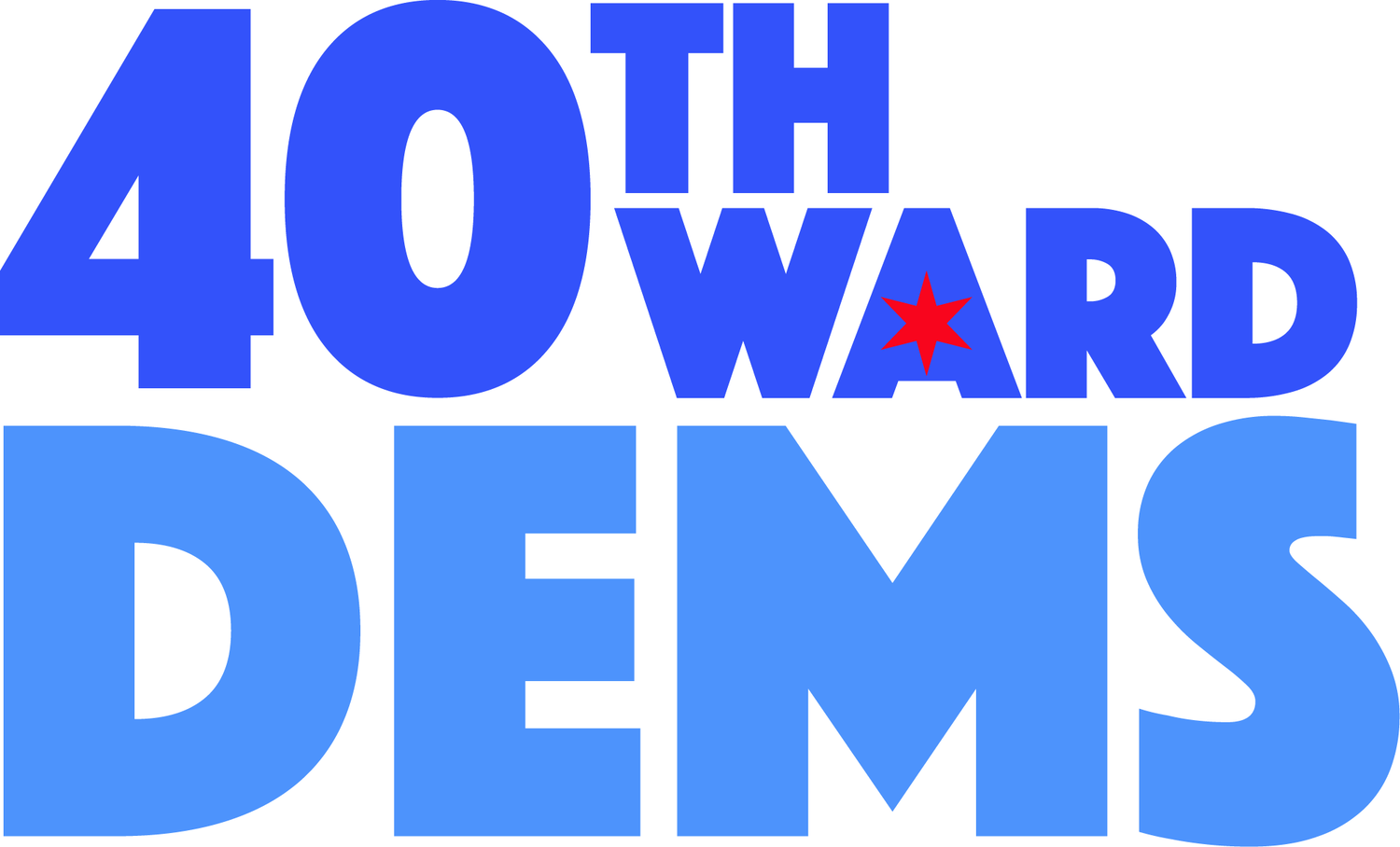
How We Designed our Logo
By: Lauren Niemchick
When thinking about political logos, the first thing that might come to mind is a candidate or organization name, underscored by a wavy line, banner, or an interpretation of the American flag. Unfortunately, how useful are these tropes as we move through a world further defined by uncertainty, division, and a global health emergency?
We know that change happens more visibly and frequently at a local level. This is why the 40th Ward Dems have centered around the goals of increasing voter turnout among residents of the ward, expanding and protecting polling places. We aim to bring new energy and motivate people to vote their values during this critical election year.
With these goals in mind - and thinking ahead to the important work that Democrats need to continue - I created the logo to reflect the vibrancy of the Democratic spirit and inspire strength in unity. The solidity of the clean capital letters and the boldness of the typography creates the feeling of a call to action. The main color, Bright Blue, is a hue that is an energetic cousin of the Pantone color of the year: Classic Blue.
Our community has many diverse members from all walks of life and political leanings, and each of our neighbors brings something unique and useful to the table. Additional blues run the gamut to signify this coalition of solidarity between all of the different schools of thought within the Democratic party, unified as “Dems.”
Finally, a pop of Torch Red in a star from Chicago’s flag makes the logo unique to our city and shines against a backdrop of Midnight Blue. I had a ton of fun creating a logo and I hope you agree and join us!

